Analyzing Prison Data in R
My good friend Danilo Freire and I have just finished a little R data package, called prisonbrief. We hope that it will be useful for R users, particularly researchers in the area, since this is still a much understudied topic. Why does prison population change? In many countries, it is rising, and has been for some time, and the determinants of this rise are still not well understood. All the data in the package come from the fantastic World Prison Brief website – we thank them for making these data available. You can contribute to the project here.
With that in mind, I thought I’d give a quick introduction to the package here on my blog. The package is on CRAN, so it’s easily installed:
install.packages("prisonbrief")

library(prisonbrief)
library(dplyr)
library(ggplot2)
While rising prisoner numbers are not news in the United States, we can take a look at other parts of the world using the wpb_table() function and specifying the region or country of interest (using a single country as an argument returns a les useful table – we recommend requesting a region). We can have a look at Western Europe. Could the Social-Democratic EU be showing similar patterns? In the following code, I download the data for Europe and filter it to have the selection of countries I want.
westeros <- wpb_table(region = "Europe") %>%
  filter(country %in%  c("Italy", "Portugal", "Spain",
                        "Iceland", "Belgium", "France",
                        "United Kingdom: Scotland",
                        "United Kingdom: Northern Ireland",
                        "United Kingdom: England & Wales",
                        "Ireland, Republic of",
                        "Germany", "Sweden", "Denmark",
                        "Norway", "Netherlands"))
Let’s combine these data with the table of the USA. Then we can graph the prison population rate.
usa <- wpb_table(region = "North America") %>%
  filter(country == "United States of America")

we_usa <- rbind(westeros, usa) %>%
  mutate(country = gsub("United Kingdom: ", "", country),
         country = gsub(", Republic of", "", country))
Sharp-sighted useRs may notice we’re using rbind() here instead of something like dplyr::full_join() or even dplyr::bind_rows(). This is because of the sf geometry column – sf is awesome, but it’s not quite ready yet, and the sf class gets stripped with these joins & binds from dlyr.
ggplot(we_usa, aes(x = reorder(country, prison_population_rate),
                   y = prison_population_rate,
                   fill = prison_population_rate)) +
  geom_bar(stat = "identity", colour = "#0B1D51") +
  theme_minimal() + labs(y = NULL, x = NULL) +
  coord_flip() + theme(legend.position = "none",
                       axis.text.y = element_text(colour = "#0B1D51"),
                       panel.grid.major = element_line(colour = "#0B1D51"),
                       panel.grid.minor = element_line(colour = "#797596")) +
  geom_text(aes(label = prison_population_rate),
            position = position_dodge(.9), colour = "#0B1D51",
                    hjust = 1.2, size = 3.3) +
  scale_fill_continuous(low = "#CC978E", high = "#D44D5C")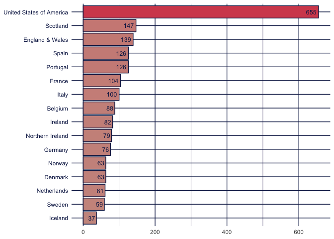
Well, so far, quite as expected, apart from the almost-eviltastic number for the topspot 🤘. Let’s take a look at female prisoners as a percentage of prisoner population:
ggplot(we_usa, aes(x = reorder(country, `female-prisoners`),
                   y = `female-prisoners`,
                   fill = `female-prisoners`)) +
  geom_bar(stat = "identity", colour = "#292F36") +
  theme_minimal() + labs(y = NULL, x = NULL) +
  coord_flip() + theme(legend.position = "none",
                       axis.text.y = element_text(colour = "#292F36"),
                       panel.grid.major = element_line(colour = "#FF6B6B")) +
  geom_text(aes(label = `female-prisoners`),
            position = position_dodge(.9), colour = "#292F36",
                    hjust = 1.2, size = 3.3) +
  scale_fill_continuous(low = "#FFFFFF", high = "#4ECDC4")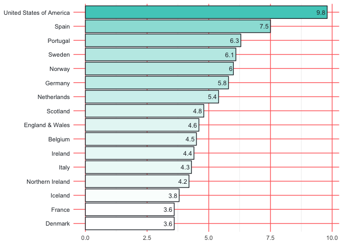
Much less difference between the countries here, definitely, but we still see the USA far ahead as we might expect. We can also have alook at some other interesting data, that of pre-trial detainees and foreign prisoners:
ggplot(we_usa, aes(x = reorder(country, `pre-trial-detainees`),
                   y = `pre-trial-detainees`,
                   fill = `pre-trial-detainees`)) +
  geom_bar(stat = "identity", colour = "#0B5563") +
  theme_minimal() + labs(y = NULL, x = NULL) +
  coord_flip() + theme(legend.position = "none",
                       axis.text.y = element_text(colour = "#5E5C6C"),
                       panel.grid.major = element_line(colour = "#BEB8EB")) +
  geom_text(aes(label = `pre-trial-detainees`),
            position = position_dodge(.9), colour = "#084C61",
                    hjust = 1.2, size = 3.3) +
  scale_fill_continuous(low = "#A2BCE0", high = "#5299D3")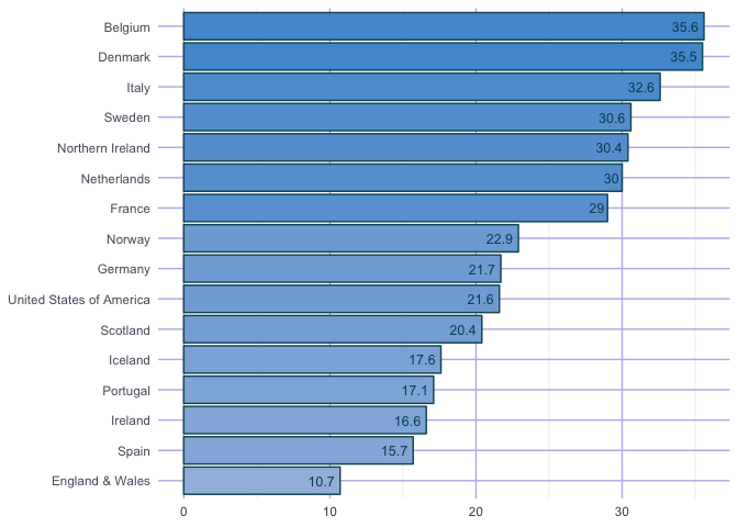
ggplot(we_usa, aes(x = reorder(country, `foreign-prisoners`),
                   y = `foreign-prisoners`,
                   fill = `foreign-prisoners`)) +
  geom_bar(stat = "identity", colour = "#3C1518") +
  theme_minimal() + labs(y = NULL, x = NULL) +
  coord_flip() + theme(legend.position = "none",
                       axis.text.y = element_text(colour = "#3C1518"),
                       panel.grid.major = element_line(colour = "#69140E")) +
  geom_text(aes(label = `foreign-prisoners`),
            position = position_dodge(.9),
                    hjust = 1.1, size = 3.3) +
  scale_fill_continuous(low = "#F2F3AE", high = "#A44200")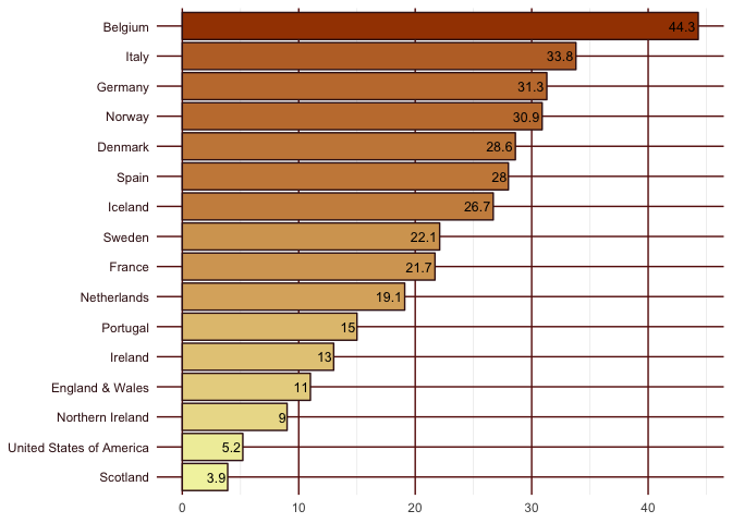
Here we do see a radically different pattern, one perhaps legal experts of the countries involved may recognise (I’m not one, so I don’t). With regards to these two categories, Belgium, Italy, Denmark, Sweden and Norway all find themselves in the top seven in both.
Another important category of data returned by wpb_table() refers to the official capacity level of the penal institutions in the country.
ggplot(we_usa, aes(x = reorder(country, `occupancy-level`),
                   y = `occupancy-level`,
                   fill = `occupancy-level`)) +
  geom_bar(stat = "identity", colour = "#261447") +
  theme_minimal() + labs(y = NULL, x = NULL) +
  coord_flip() + theme(legend.position = "none",
                       axis.text.y = element_text(colour = "#261447"),
                       panel.grid.major.x = element_line(colour = "#C0BDA5"),
                       panel.grid.major.y = element_line(colour = "#C0BDA5")) +
  geom_text(aes(label = `occupancy-level`),
            position = position_dodge(.9),
                    hjust = 1.1, size = 3.3, colour = "#261447") +
  scale_fill_continuous(low = "#FFCAD7", high = "#FF3864")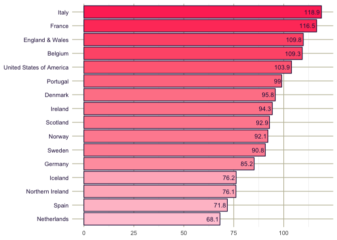
Most countries are very close to capacity, with only Holland ducking under 70%. France, although it spends an enormous percentage of its GDP on public services, is no stranger to criticism of its prison conditions.
Well, we hope that prisonbrief will be useful for those studying prisons, or even for those needing quick and interesting datasets for teaching/learning R. For those interested in the topic at hand, Danilo has some interesting research that you can find here. His PhD supervisor, David Skarbek, is a well-known expert in the field and well worth checking out if prisons are your particular fancy!